Best SaaS Landing Page Examples That Actually Convert
Author

The best SaaS landing pages all have one thing in common: they make a clear promise and quickly show what they can deliver. There’s no unnecessary content, no feature lists pretending to be value statements, and no vague hero sections.
But most SaaS landing pages fall into these traps. They explain what the software does, but not why it matters. They ask for sign-ups before building trust, and they send everyone to a generic page that doesn’t address anyone’s needs.
The data backs this up. Unbounce's Conversion Benchmark Report says the median SaaS landing page converts at just 3.8%, which is about 42% lower than the average across all industries. The top examples here often reach 8-12%. The difference isn’t in product quality; it’s in design and messaging.
This article looks at some of the best SaaS landing pages that actually convert. For each one, you’ll see what works, the UX and copywriting principles behind it, and a few design tips from Foundey that early-stage SaaS companies can use right away. Whether you’re building your first landing page or reviewing an old one, these examples offer a clear guide.
What Separates a High-Converting SaaS Landing Page from a Mediocre One
Before we get to the examples, here’s the checklist. Every page here meets five key criteria. Use these as a framework when you review any landing page, even your own.
Specificity of the value proposition
Generic headlines like 'The all-in-one platform for your team' don’t convert well because they don’t say anything meaningful. The best SaaS landing pages start with a specific, outcome-focused statement that names a problem and hints at the solution. The more specific the claim, the more people trust it.
Speed of social proof
The best pages show credibility right away. Logos, stats, review badges, and customer quotes appear early, often before the first call to action. This isn’t just for looks. Research shows that testimonials and social proof can boost conversion rates by up to 34%.
Single conversion focus
Every extra call to action on a page competes for attention and lowers the chance of conversion. Research shows that having more than one offer can cut conversion rates by up to 266%. The best SaaS landing pages focus on one main goal, repeating it as you scroll rather than adding new ones.
Product demonstration above the fold
SaaS products aren’t physical, so the best landing pages make them feel real with screenshots, short videos, animated previews, or interactive demos. When visitors see the product in action, they’re more likely to sign up.
Frictionless mobile experience
More than half of web traffic comes from mobile devices, and over half of those users will leave if a page takes more than 3 seconds to load. Speed and responsiveness aren’t optional; they’re must-haves for a good landing page.
The Best SaaS Landing Page Examples That Convert
Notion: AI-First Positioning Executed with Clarity
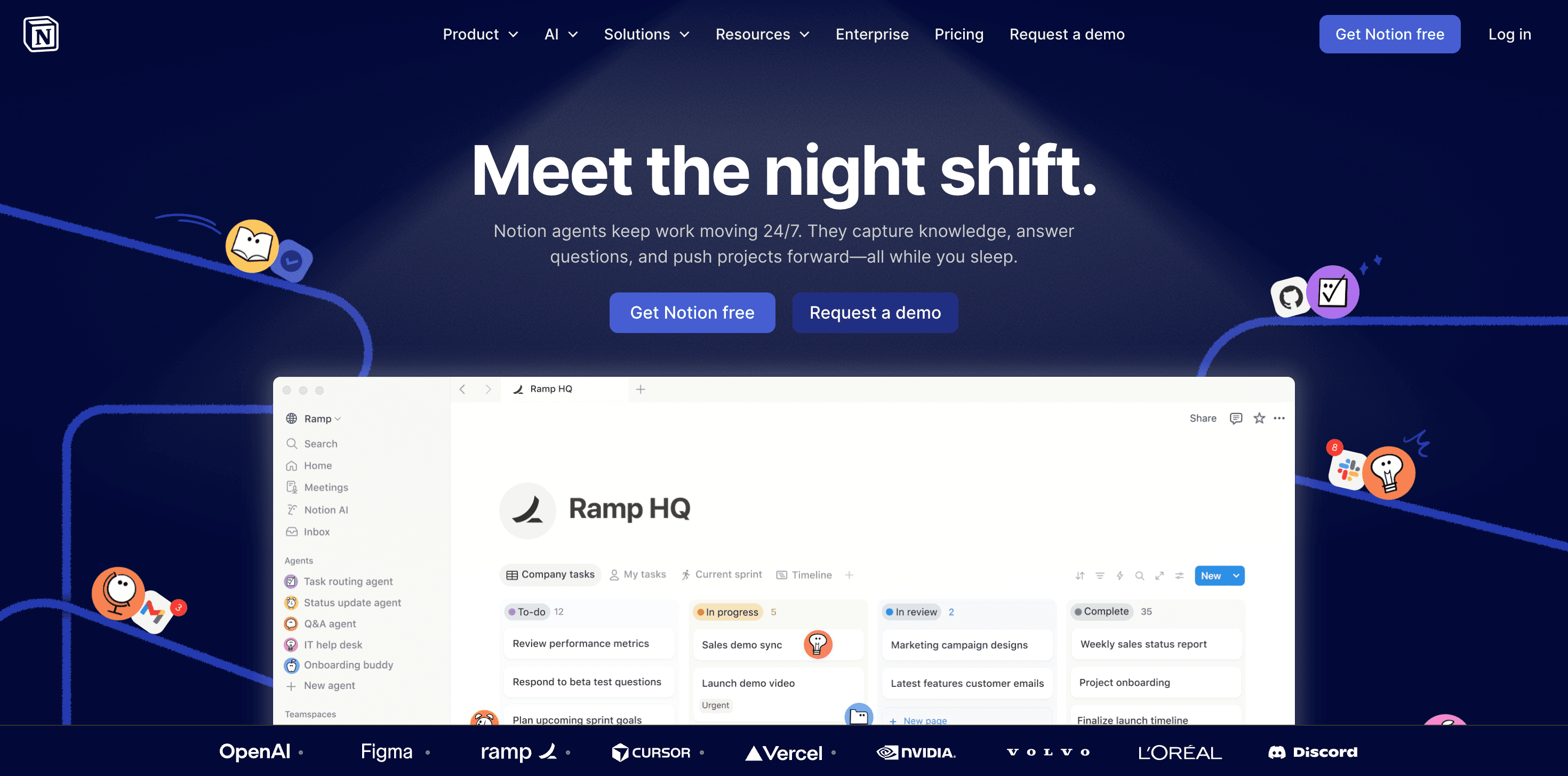
Notion’s current headline, "Meet the night shift," marks a clear shift from the brand’s old emotional style. The subheadline focuses on consolidation and AI-first usefulness instead of feelings. The hero section is simple and direct: one headline, two CTAs ("Get Notion free" and “Request a demo”) that address cost concerns right away, and just below, an interactive use-case selector lets visitors pick their scenario and see Notion in action. It’s a smart way to show the product without using static screenshots.
Stripe: The Power of Radical Restraint
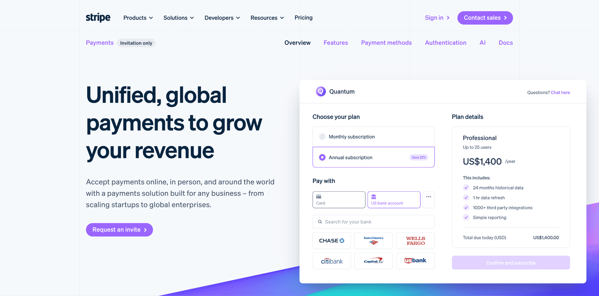
Stripe’s landing page is often mentioned in SaaS conversion studies for one reason: it’s disciplined. The headline, "Unified, global payments to grow your revenue," is clear, focused on results, and leaves no room for confusion. There’s one value proposition, one CTA, no distracting links, and no extra offers. The subheadline builds on the promise, and every word matters.
Insight: Adding more than one offer or CTA to a landing page can decrease conversion rates by up to 266%. Stripe treats this as doctrine.
Foundey’s Note: Before your next landing page revision, count your CTAs. If there is more than one primary action, you have a conversion problem waiting to happen.
Calendly: Outcome-First Messaging at Its Best
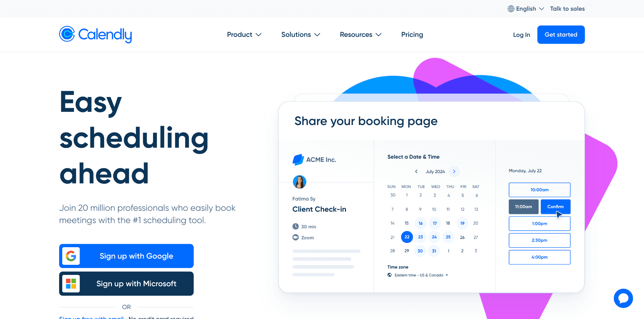
Calendly’s homepage is a great example of using an outcome-focused headline with a social proof subheadline. The headline, "Easy scheduling ahead," tells visitors what they’ll get, not what the software is or costs, but the result. The subheadline backs it up with proof. In just one line, Calendly gives both a goal and reassurance, showing visitors where they’re going and that millions have already made it.
The call to action is right at the top, with nothing else competing for attention. As you scroll, the page clearly breaks down the benefits, uses simple visuals to show how the product works step by step, and adds customer logos as social proof before asking for a greater commitment.
Foundey’s Note: Your homepage has two lines to make a first impression: the headline and the subheadline. Calendly uses the headline for the outcome and the subheadline for social proof. Most SaaS companies use both lines for features. The difference shows up directly in conversion rates.
Figma: Copy That Expands the Visitor's Ambition
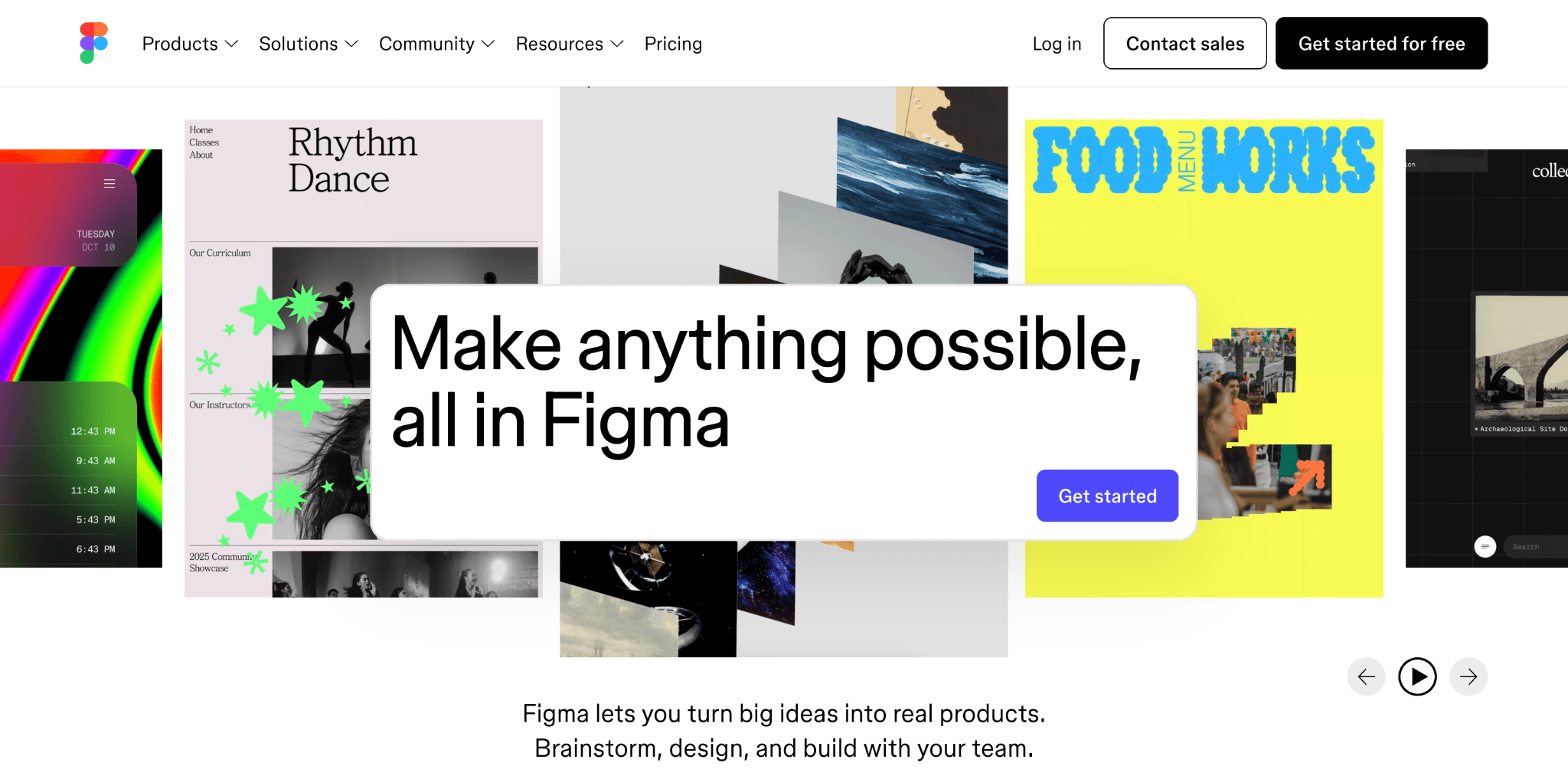
Figma’s homepage headline, "Make anything possible, all in Figma," is one of the most carefully crafted lines here. It doesn’t list features or promise speed. Instead, it gives visitors permission to dream big. The word "anything" removes limits before you even scroll. The subheadline brings that ambition down to earth: "Figma lets you turn big ideas into real products. Brainstorm, design, and build with your team." Three verbs in one sentence cover the full product scope, no feature list needed.
This approach works because it fits Figma’s growing product suite. Figma now includes design, prototyping, FigJam whiteboards, Slides, Sites, Draw, and Make, tools for designers, engineers, product managers, and non-technical teams. A narrow headline wouldn’t cover all that. "Make anything possible, all in Figma" does, since "anything" is broad enough for every use case. The phrase "all in Figma" is the key selling point, appealing to visitors who are tired of using multiple tools.
Slack: Metaphor-Led Positioning in an AI-First Market
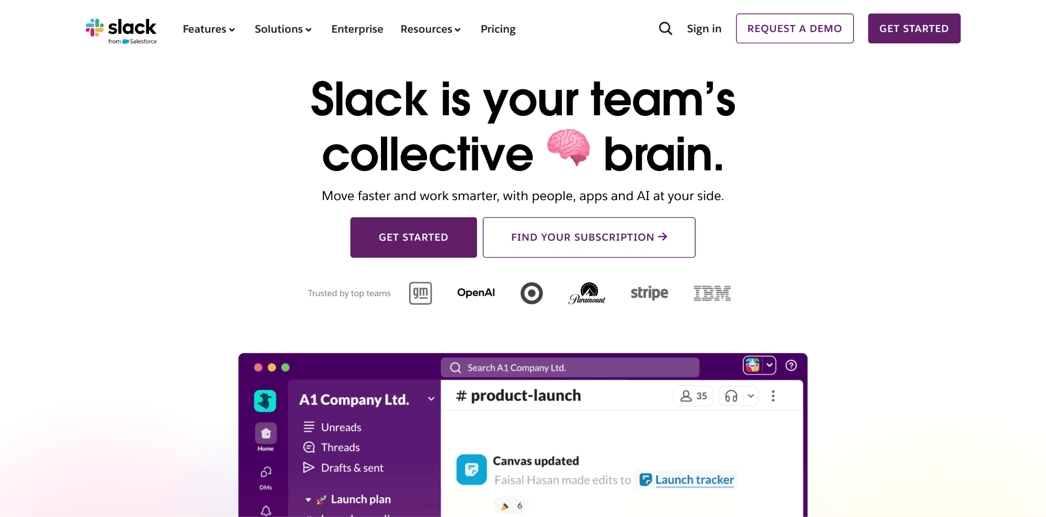
Slack’s new headline, “Slack is your team’s collective brain,” marks a big change from the brand’s earlier, more functional messaging. Instead of explaining what Slack does, the headline focuses on what it becomes for your team: a shared intelligence layer. The phrase “collective brain” is a powerful metaphor. It suggests memory, context, and accumulated knowledge, things that often disappear when teams use scattered tools. This positions Slack as the place where nothing gets lost.
The subheadline builds on this idea: “Move faster and work smarter, with people, apps, and AI at your side.” In one line, it highlights three key benefits: speed, intelligence, and a complete ecosystem that brings people and AI together.
Slack’s focus on AI is intentional. The platform now includes AI throughout, from Slackbot, which uses company data to chat, to Agentforce Sales, and AI-powered summaries and search. The homepage headline shows this shift. By calling Slack a “collective brain” instead of just a messaging tool, the brand moves beyond basic chat apps and positions itself as the smart system for how your team works and thinks.
Slack stands out because it continues to invest in audience segmentation. Beyond the homepage, Slack creates pages for different team sizes, industries, and roles, each with messaging and calls to action tailored to those groups.
HubSpot: Audience-First Headlines With a Rotating Verb Trick
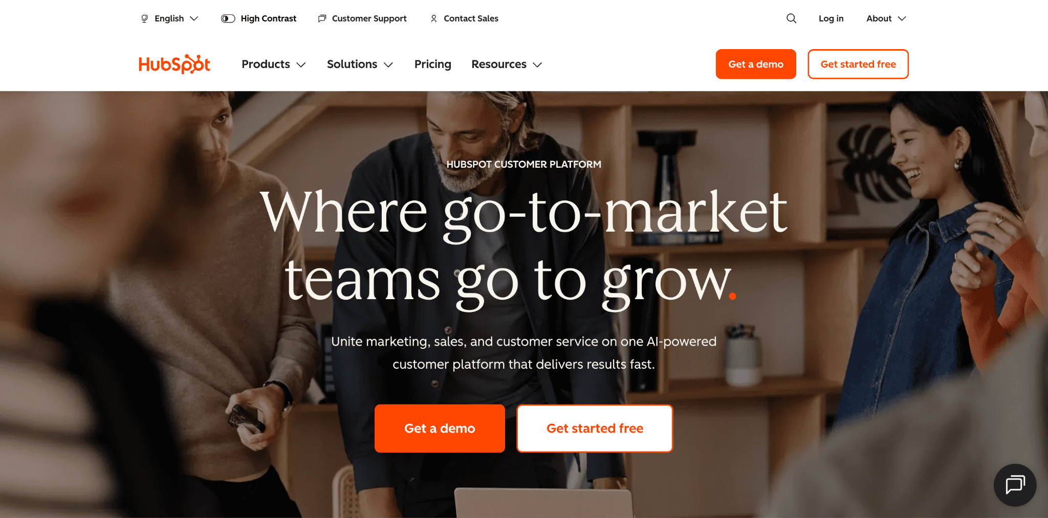
HubSpot’s homepage headline is smart in a way most SaaS companies don’t try. The main headline says, “Where go-to-market teams go to,” and then cycles through four verbs: grow, scale, close, and retain. This isn’t just for show. Each verb speaks to a different buyer: marketing leaders care about growth, sales leaders focus on closing, and customer success teams want retention. Instead of picking one message and leaving out the others, HubSpot uses this rotating text to reach all four groups at once.
The subheadline brings these ideas together. It mentions platform consolidation, AI, and speed, three top reasons people buy B2B SaaS. The page supports the headline with trust signals such as customer logos and real results, and includes two clear calls to action: “Get a demo” and “Get started free.” These options help buyers at different decision stages.
Insight: Usually, animated or rotating text is just for looks. HubSpot makes it useful; each rotating word speaks to a different buyer’s main concern, so one headline delivers four targeted messages in a row.
Airtable: Unification Positioning That Speaks Directly to Enterprise Friction
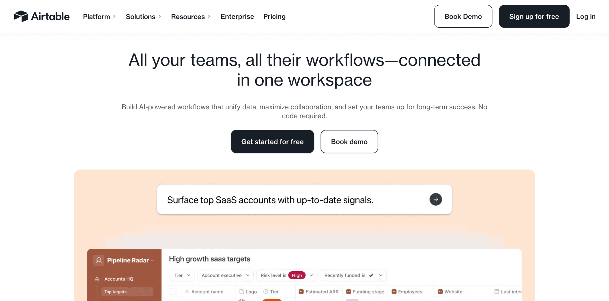
Airtable’s homepage tackles a familiar issue in enterprise software: fragmentation. The headline, “All your teams, all their workflows connected in one workspace,” immediately presents the problem and the solution. It avoids mentioning features, technical jargon, or category labels.
This is a clear example of outcome framing. It works because it describes a situation every mid-market or enterprise buyer knows: departments using different tools, data stuck in silos, and no central place to bring it all together. The page title supports this strategy from another angle: "Build enterprise ready AI workflows, apps, and agents," which appeals directly to IT and operations buyers looking for these features.
The subheadline highlights three clear benefits. Finishing with “No code required” is a proven way to address concerns and keep non-developers reading. Airtable also stands out by offering dedicated feature and use-case pages, each tailored to a specific audience. The homepage makes the main promise, while the deeper pages help persuade different types of buyers.
Intercom: Product-Led Copywriting That Converts Through Specificity
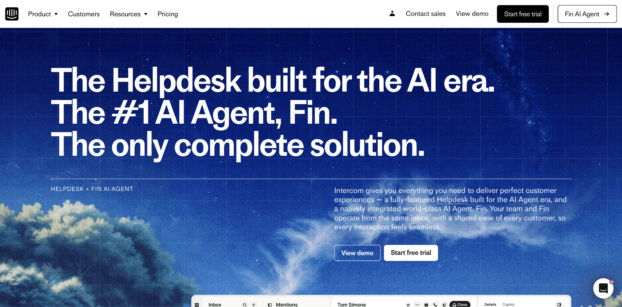
Intercom's homepage starts with a headline that covers three points at once: "The Helpdesk built for the AI era. The #1 AI Agent, Fin. The only complete solution." It names the category (helpdesk), positions it (built for the AI era), introduces the product (Fin), and claims to be the only complete solution, all before any body copy. This approach quickly addresses common objections. The category label reassures visitors they are in the right place. Mentioning the AI era shows the product is modern, not just updated with AI features. Naming the agent, Fin, adds detail that generic AI claims lack. Finally, calling it "the only complete solution" discourages visitors from comparing it to other options.
The subheadline builds on the headline: "Intercom gives you everything you need to deliver perfect customer experiences." This is a focused subheadline. It mentions the structure, the outcome, the product (Fin), and the integration model in just two sentences. Most SaaS subheadlines are less detailed. Intercom uses every word to address doubts a customer support buyer might have before a demo.
SaaS Landing Page Best Practices: What All Examples Do
Across every example in this list, a consistent set of UI/UX principles drives conversion performance. These are not optional extras. They are requirements for any SaaS landing page expected to convert at above-median rates.
Hero section
Headline leads with an outcome or a named pain point, not a feature or category label
Subheadline expands the promise without introducing new ideas or jargon
Primary CTA appears above the fold with friction-reducing language ('free', 'no credit card', '30 seconds')
Product visual or demo preview is present within the first screen
Trust architecture
Social proof (logos, stats, or testimonials) appears before the first CTA, not after it
Quantified outcomes are used instead of generic benefit statements wherever possible
Third-party validation: G2 badges, Forrester citations, SOC 2 / GDPR compliance signals for enterprise audiences
Conversion design
Single primary CTA that is repeated down the page without introducing competing actions
Navigation links in the header and footer are limited or removed to reduce exit opportunities
Mobile performance is treated as a primary requirement, not a secondary optimisation
Content structure
Benefits are presented before features, always
Audience segmentation is handled via dedicated pages rather than a single generic homepage
Specific numbers and concrete proof are used wherever vague claims might otherwise appear
The 5 Most Common SaaS Landing Page Mistakes (and How to Fix Them)
The feature-first headline
Problem: 'The all-in-one platform for project management.' This describes the product category, not the user benefit.
Fix: Rewrite the headline as an outcome. 'Ship projects on time without chasing status updates' is a benefit. It names what the user will stop experiencing.
Burying social proof
Problem: Testimonials and logos are placed at the bottom of the page, after CTAs have already been presented and may have been ignored.
Fix: Place your strongest social proof, like a row of well-known logos, a specific customer outcome, or a short testimonial, above the fold. Trust should come before asking for a conversion, not after.
Multiple competing CTAs
Problem: 'Start Free Trial', 'Book a Demo', 'Watch Video', and 'Read our Blog' all on the same page. Every additional option reduces conversion likelihood.
Fix: Choose one main conversion goal for each landing page. If needed, you can add a secondary CTA like 'Book a Demo' next to 'Start Free Trial,' but remove any other distractions.
Generic copy that matches every competitor
Problem: If you replaced your company name with a competitor's name and the page still made sense, you have a differentiation problem.
Fix: Find the one thing your product does better or differently than any competitor. Make this the focus of your main copy. Be specific so your claim is unique to your product.
Ignoring mobile performance
Problem: A page designed for desktop that technically renders on mobile, but with misaligned CTAs, illegible type, and three-second load times.
Fix: Start by testing your landing page on mobile, not after everything else. If your CTA is not the main focus on a mobile screen, you are likely missing out on conversions that desktop analytics won’t show.
Your Landing Page Is a Design Problem. Foundey Can Solve It.
Each landing page on this list was created through careful, research-based UI/UX design. None were made by accident. These pages were built by teams that saw the landing page as a product in its own right, not just a marketing add-on.
Foundey is a UI/UX design agency that partners with SaaS startups and founders to create landing pages that drive conversions. We focus on conversion, activation, and retention as clear goals, and we work as part of your product team rather than on the outside.
If your landing page isn’t converting as well as your product deserves, it’s a design problem you can fix. We solve these issues all the time. Book a free design consultation with us. We’ll review your page, find the main conversion blockers, and show you what to change.
Frequently Asked Questions
What is a good conversion rate for a SaaS landing page?
The median SaaS landing page conversion rate is 3.8%, which is approximately 42% lower than the all-industry average according to Unbounce's Conversion Benchmark Report. A good conversion rate for a well-optimised SaaS landing page is typically between 5 and 8%. Top performers in the SaaS category, like Stripe, consistently achieve 10%+ growth through disciplined single-CTA design, early social proof, and outcome-first messaging.
What should a SaaS landing page include?
Every high-converting SaaS landing page should include: a headline that leads with an outcome or named pain point, a visible CTA above the fold with friction-reducing language, social proof (logos, stats, or testimonials) positioned before the first conversion ask, product screenshots or an interactive demo, a benefit-focused feature breakdown, and a mobile-optimised design that loads in under three seconds. The most effective pages add specificity through real numbers and direct competitor comparisons.
How does social proof improve SaaS landing page conversions?
Social proof reduces perceived risk, which is the primary reason SaaS visitors hesitate to convert. Research indicates testimonials and proof signals can increase conversion rates by up to 34%. The placement of social proof matters as much as its presence: the most effective landing pages position logos, testimonials, or usage statistics before the primary CTA rather than after it. The sequence should be: establish trust, then ask for the conversion, not the other way around.
What is the ideal length for a SaaS landing page?
The ideal landing page length depends on the complexity of your product and its price point. For simple, low-cost, or free-tier SaaS tools, shorter pages with minimal friction often perform best, the product is easy to understand, and the commitment is low. For mid-market or enterprise SaaS products with longer decision cycles, longer pages that systematically address objections, demonstrate ROI, and build multiple layers of trust tend to outperform shorter equivalents. As a baseline, most high-converting SaaS landing pages have copy between 800 and 2,000 words.