
Enabling Scalable Mental Health Care for Families
Provinding affordable and complete healthcare for the whole family. Reach out people that need support and don't know how and when to do it.
Product
Visual
Enabling Scalable Mental Health Care for Families
Provinding affordable and complete healthcare for the whole family. Reach out people that need support and don't know how and when to do it.
Product
Visual
Enabling Scalable Mental Health Care for Families
Provinding affordable and complete healthcare for the whole family. Reach out people that need support and don't know how and when to do it.
Product
Visual
INDUSTRY
Heath Tech
YEAR OF ENGAGEMENT
2025
HEADQUARTERS
USA
IMPACT
Acquired
by Hazel Health
73%
User Increase
INDUSTRY
Heath Tech
YEAR OF ENGAGEMENT
2025
HEADQUARTERS
USA
IMPACT
Acquired
by Hazel Health
73%
User Increase
INDUSTRY
Heath Tech
YEAR OF ENGAGEMENT
2025
HEADQUARTERS
USA
IMPACT
Acquired
by Hazel Health
73%
User Increase
WHAT WE DID
01
Identified User Friction Points Impacting Retention
02
Enhanced Navigation to Improve User Engagement
03
Structured Content To Promote Conversion
04
Redesigned Interface to Build Confidence and Reduce Drop-Off
WHAT WE DID
01
Identified User Friction Points Impacting Retention
02
Enhanced Navigation to Improve User Engagement
03
Structured Content To Promote Conversion
04
Redesigned Interface to Build Confidence and Reduce Drop-Off
WHAT WE DID
01
Identified User Friction Points Impacting Retention
02
Enhanced Navigation to Improve User Engagement
03
Structured Content To Promote Conversion
04
Redesigned Interface to Build Confidence and Reduce Drop-Off
WHAT WE DID
01
Identified User Friction Points Impacting Retention
02
Enhanced Navigation to Improve User Engagement
03
Structured Content To Promote Conversion
04
Redesigned Interface to Build Confidence and Reduce Drop-Off
01
UX RESEARCH
Identified User Friction Points Impacting Retention
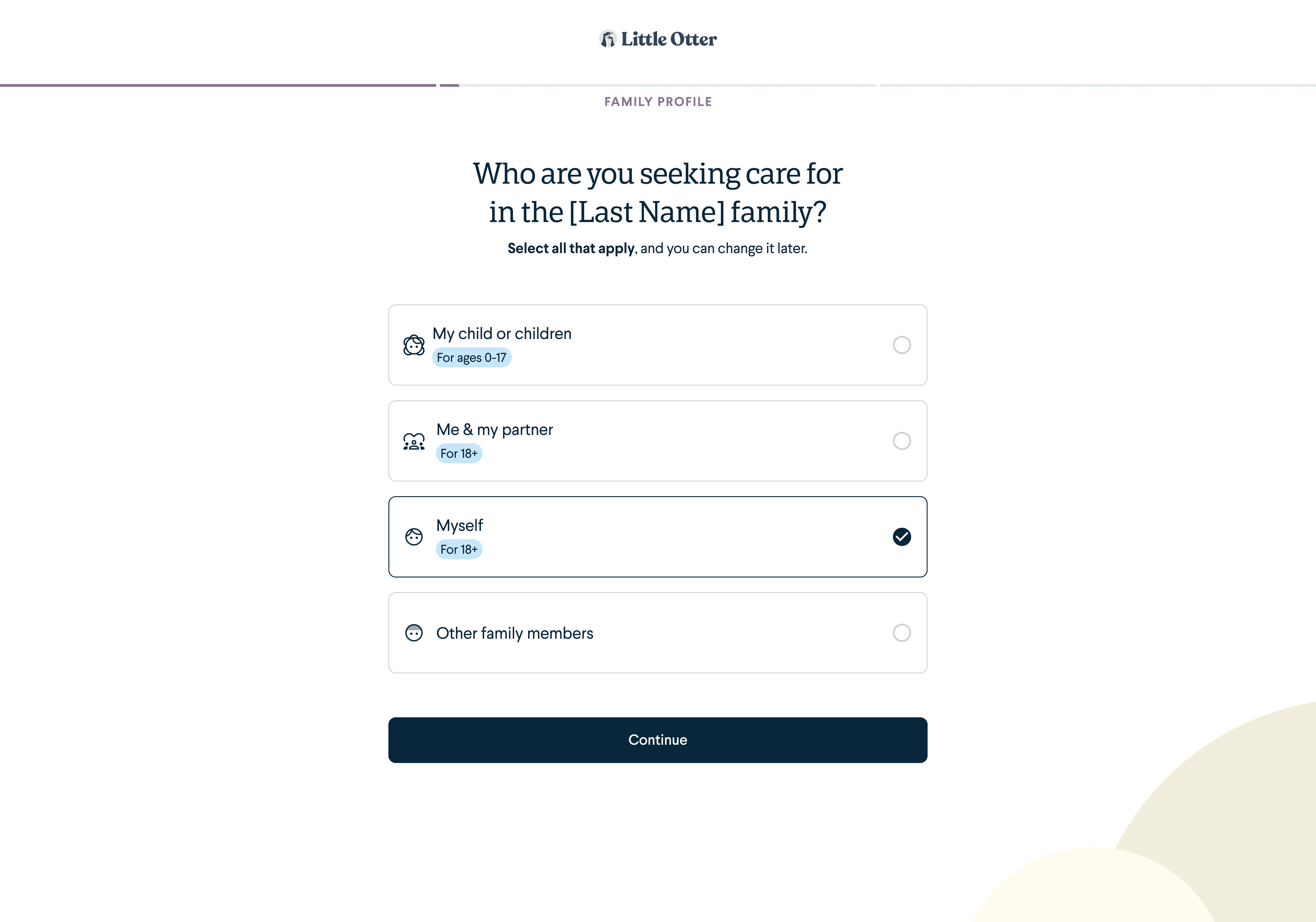
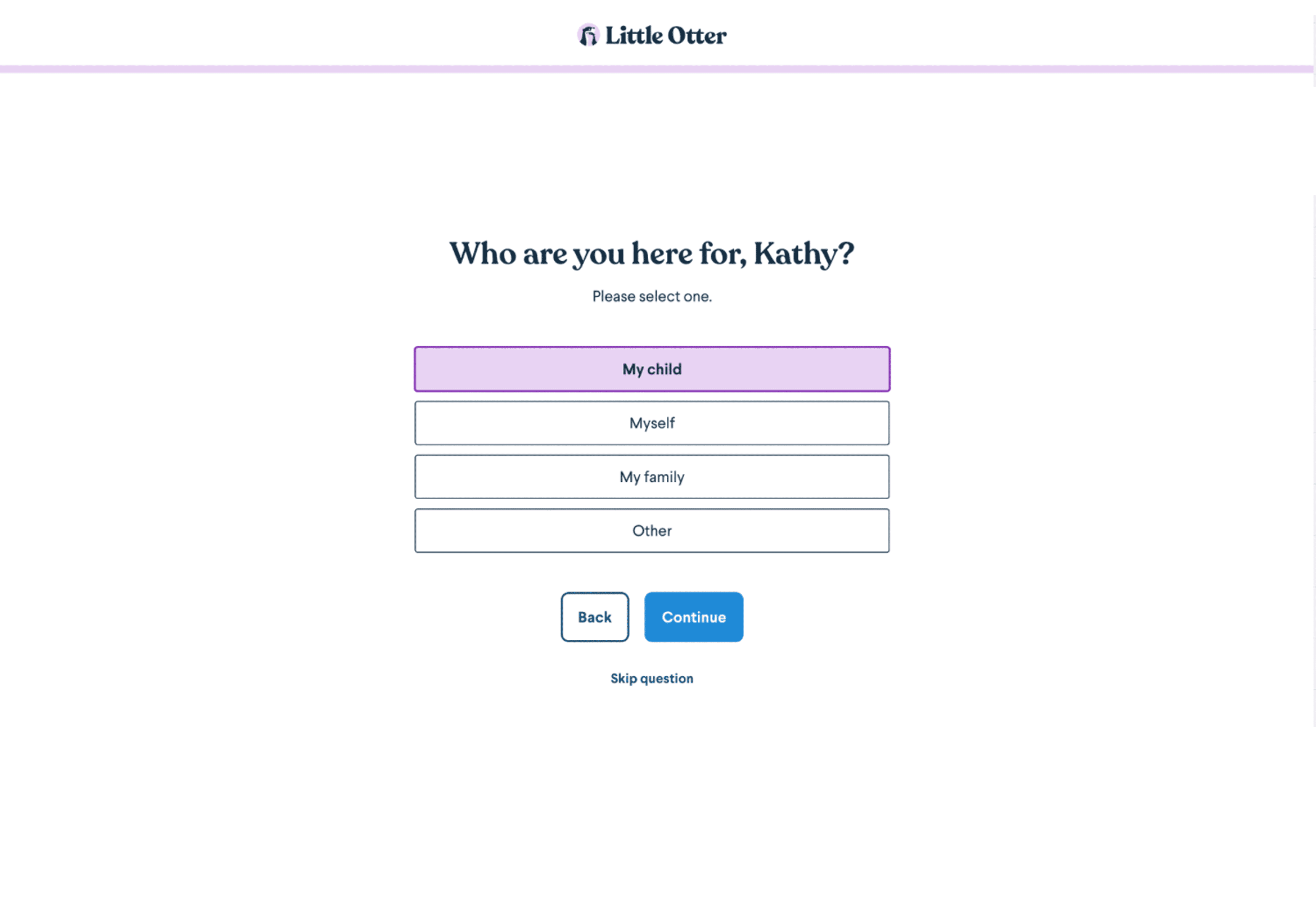
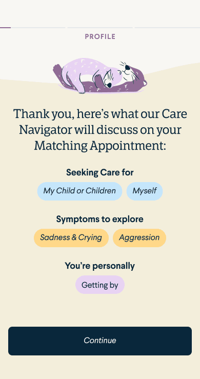
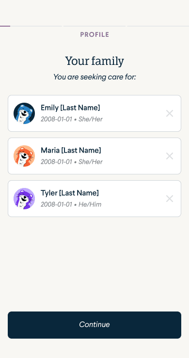
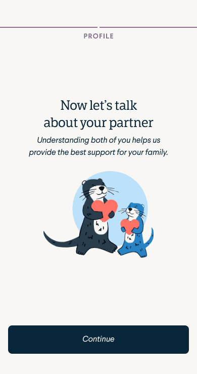
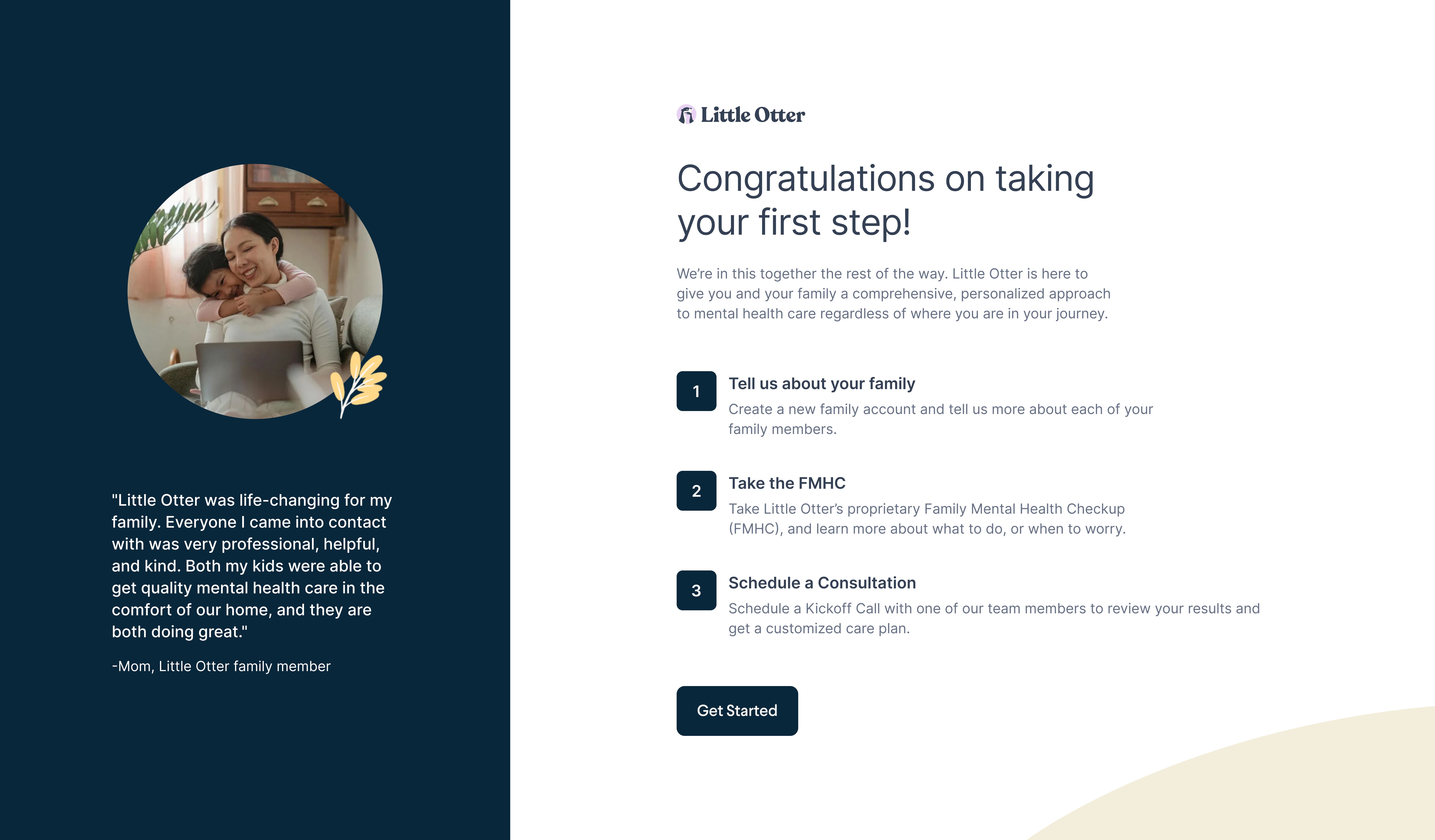
The initial signup flow lacked emotional appeal and suggested that the app was only for children. We redesigned onboarding to be more family-focused, redesigning playful illustrations and bringing human faces of care coordinators. Clear messaging about booking real consultations, along with personalized interactive elements, helped users feel supported and confident improving activation and retention.
01
UX RESEARCH
Identified User Friction Points Impacting Retention
The initial signup flow lacked emotional appeal and suggested that the app was only for children. We redesigned onboarding to be more family-focused, redesigning playful illustrations and bringing human faces of care coordinators. Clear messaging about booking real consultations, along with personalized interactive elements, helped users feel supported and confident improving activation and retention.
01
UX RESEARCH
Identified User Friction Points Impacting Retention
The initial signup flow lacked emotional appeal and suggested that the app was only for children. We redesigned onboarding to be more family-focused, redesigning playful illustrations and bringing human faces of care coordinators. Clear messaging about booking real consultations, along with personalized interactive elements, helped users feel supported and confident improving activation and retention.
01
UX RESEARCH
Identified User Friction Points Impacting Retention
The initial signup flow lacked emotional appeal and suggested that the app was only for children. We redesigned onboarding to be more family-focused, redesigning playful illustrations and bringing human faces of care coordinators. Clear messaging about booking real consultations, along with personalized interactive elements, helped users feel supported and confident improving activation and retention.
02
UX Design
Enhanced Navigation to Improve User Engagement
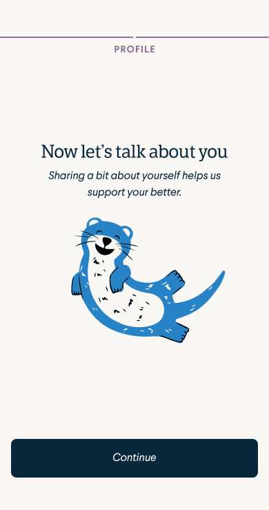
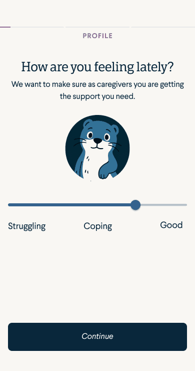
The onboarding was updated to work on mobile, ensure the user wans't dropping and get the information of the family as he goes. We made changes like choosing where to place the login wall, when to show the pricing information, giving option to skip adding family, having WOW moments in the flow to keep the user engaged.
02
UX Design
Enhanced Navigation to Improve User Engagement
The onboarding was updated to work on mobile, ensure the user wans't dropping and get the information of the family as he goes. We made changes like choosing where to place the login wall, when to show the pricing information, giving option to skip adding family, having WOW moments in the flow to keep the user engaged.
02
UX Design
Enhanced Navigation to Improve User Engagement
The onboarding was updated to work on mobile, ensure the user wans't dropping and get the information of the family as he goes. We made changes like choosing where to place the login wall, when to show the pricing information, giving option to skip adding family, having WOW moments in the flow to keep the user engaged.
02
UX Design
Enhanced Navigation to Improve User Engagement
The onboarding was updated to work on mobile, ensure the user wans't dropping and get the information of the family as he goes. We made changes like choosing where to place the login wall, when to show the pricing information, giving option to skip adding family, having WOW moments in the flow to keep the user engaged.
"We had a great product that wasn't user-ready and no design system. Foundey's team was genuinely curious, they wanted to learn everything about the product and our users, and they made it all happen. A real game changer."
Brody Clemmer
Product Manager

"We had a great product that wasn't user-ready and no design system. Foundey's team was genuinely curious, they wanted to learn everything about the product and our users, and they made it all happen. A real game changer."
Brody Clemmer
Product Manager
"We had a great product that wasn't user-ready and no design system. Foundey's team was genuinely curious, they wanted to learn everything about the product and our users, and they made it all happen. A real game changer."
Brody Clemmer
Product Manager
03
UX Writing
Structured Content for Clearer Insights and Action
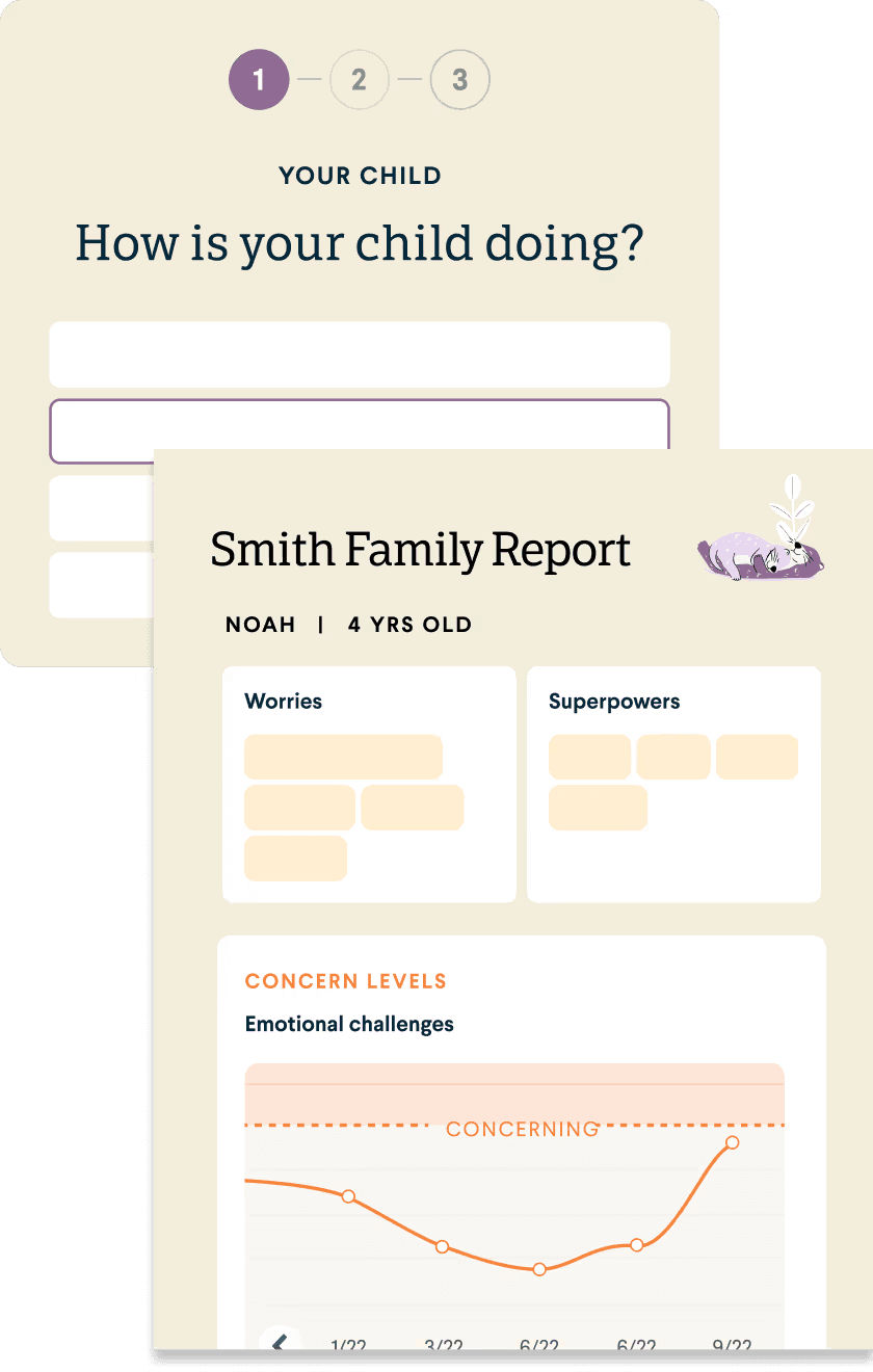
Even if family don't have a care provided in their state, they could get supported filling Family Mental Health Checkup Report. This report was reorganized into smaller, digestible sections with enhanced summaries that highlight critical family mental health insights. This clear structure helps users quickly understand and act on the information, improving engagement and driving better health outcomes. Simplifying content delivery also supports higher retention and positions the report as a trusted resource.
03
UX Writing
Structured Content for Clearer Insights and Action
Even if family don't have a care provided in their state, they could get supported filling Family Mental Health Checkup Report. This report was reorganized into smaller, digestible sections with enhanced summaries that highlight critical family mental health insights. This clear structure helps users quickly understand and act on the information, improving engagement and driving better health outcomes. Simplifying content delivery also supports higher retention and positions the report as a trusted resource.
03
UX Writing
Structured Content for Clearer Insights and Action
Even if family don't have a care provided in their state, they could get supported filling Family Mental Health Checkup Report. This report was reorganized into smaller, digestible sections with enhanced summaries that highlight critical family mental health insights. This clear structure helps users quickly understand and act on the information, improving engagement and driving better health outcomes. Simplifying content delivery also supports higher retention and positions the report as a trusted resource.
03
UX Writing
Structured Content for Clearer Insights and Action
Even if family don't have a care provided in their state, they could get supported filling Family Mental Health Checkup Report. This report was reorganized into smaller, digestible sections with enhanced summaries that highlight critical family mental health insights. This clear structure helps users quickly understand and act on the information, improving engagement and driving better health outcomes. Simplifying content delivery also supports higher retention and positions the report as a trusted resource.
04
Redesign
Redesigned Interface to Build Confidence and Reduce Drop-Off
A MVP was created to ensure user would now where to go and preserve Little Otter's branding. After that a new system was created to migrate from Healthie whitelabel and have a single place for the company;s communication. This clean, purposeful design reduces cognitive overload, builds user trust, and encourages deeper engagement. The result is a smoother user journey that lowers drop-off rates and supports sustained growth.
04
Redesign
Redesigned Interface to Build Confidence and Reduce Drop-Off
A MVP was created to ensure user would now where to go and preserve Little Otter's branding. After that a new system was created to migrate from Healthie whitelabel and have a single place for the company;s communication. This clean, purposeful design reduces cognitive overload, builds user trust, and encourages deeper engagement. The result is a smoother user journey that lowers drop-off rates and supports sustained growth.
04
Redesign
Redesigned Interface to Build Confidence and Reduce Drop-Off
A MVP was created to ensure user would now where to go and preserve Little Otter's branding. After that a new system was created to migrate from Healthie whitelabel and have a single place for the company;s communication. This clean, purposeful design reduces cognitive overload, builds user trust, and encourages deeper engagement. The result is a smoother user journey that lowers drop-off rates and supports sustained growth.
04
Redesign
Redesigned Interface to Build Confidence and Reduce Drop-Off
A MVP was created to ensure user would now where to go and preserve Little Otter's branding. After that a new system was created to migrate from Healthie whitelabel and have a single place for the company;s communication. This clean, purposeful design reduces cognitive overload, builds user trust, and encourages deeper engagement. The result is a smoother user journey that lowers drop-off rates and supports sustained growth.
See more work from Foundey



See more work from Foundey
See more work from Foundey
Making the right product decisions starts here
Reach product market fit and hypergrowth faster
We analyze your product, identify what’s creating friction, and help you define the right priorities, what to fix and build next.
Making the right product decisions starts here
Reach product market fit and hypergrowth faster
We analyze your product, identify what’s creating friction, and help you define the right priorities, what to fix and build next.
Making the right product decisions starts here
Reach product market fit and hypergrowth faster
We analyze your product, identify what’s creating friction, and help you define the right priorities, what to fix and build next.